International Medical Corps
A first-responder nonprofit organization engaged Russ Reid to recommend a fundraise-focused information architecture (IA) for the future website redesign.
Overview
The IA included a robust number of content management system (CMS) layouts (more than 30) for the client to create content quickly within the platform. Each layout incorporated various interaction mechanisms to produce a user experience (UX) that was informative and drove donation behavior.
As the hands-on creative lead, I was tasked with overseeing two digital art directors and presenting the complete IA recommendation to the client.
Approach
Like every large-scale UX project, we implemented the appropriate process which included the following:
A research phase with the client and strategy team
An IA phase where we focused on the sitemap and wireframes
As a recommendation, desktop and mobile wireframes were required; however, only the desktop wireframes were created due to agreed upon resources. Therefore, responsive methods were incorporated throughout.
A user interface phase was not part of the scoped request; therefore, we did not create the UI design or the design system.
Role
Associate Creative Director, Digital
Information Architecture
By collaborating with the Digital Strategy Team, we infused optimal fundraising strategies into the sitemap. This included organizing the current website’s content into an evolved form based on analytics. We listened to the client’s future needs, combed through all of the content, and consolidated information where appropriate. The 30-plus layouts mentioned previously were incorporated throughout the website to present content in an engaging manner. A clear parent-child relationship within each category can be seen in the sitemap below.
Sitemap

Global Navigation
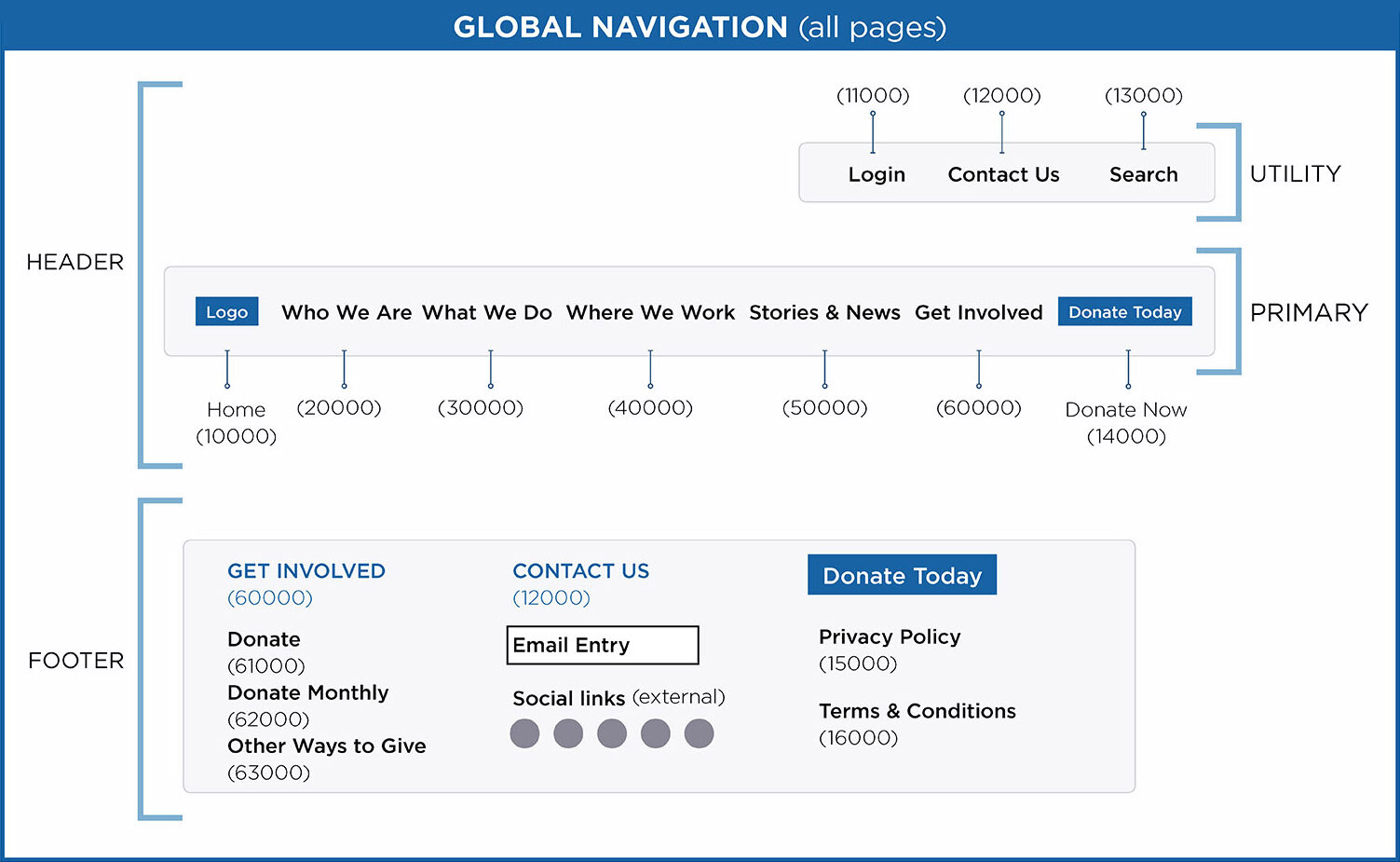
Sitemap Legend

Wireframes
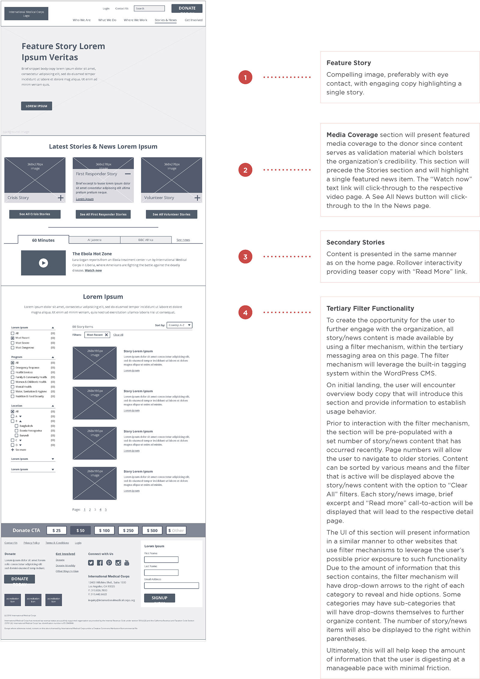
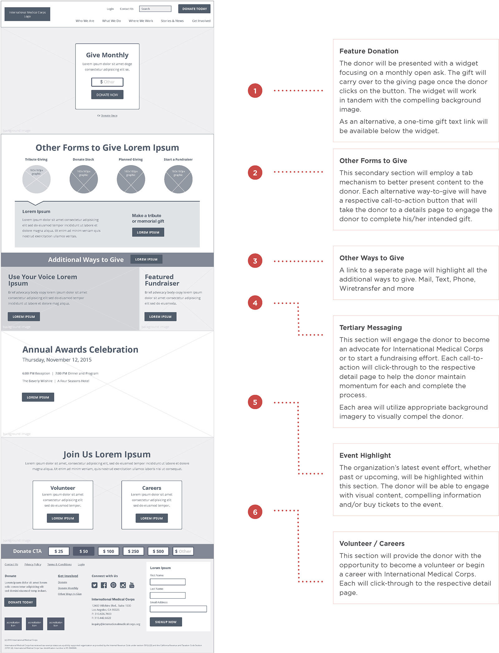
Below, you will see a couple of low-fidelity wireframes which present the messaging hierarchy for the example. Each wireframe included annotations for reference to assure comprehension of the wireframe itself post-presentation. Interaction mechanisms were also shown along with alternatives within the wireframe.
Of course, the team and I started with pencil and paper prior to the presented pieces seen here. Keep in mind that there was more than 30 wireframes which are not all shown here.
Home Page
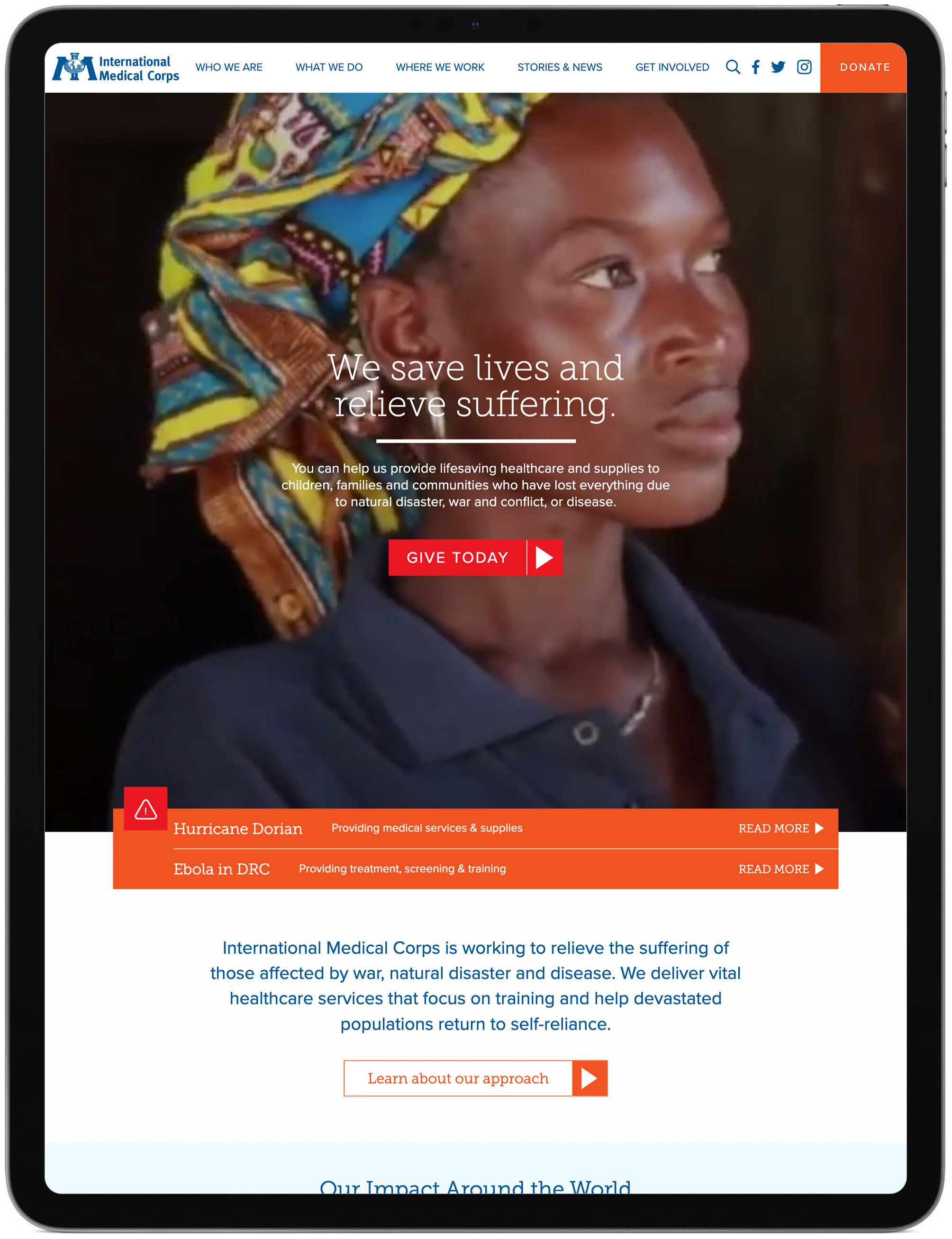
As you can see by the 2019 screenshot on the right, a majority of the recommended wireframe was honored in the user interface (UI) designed by the client.
Client Presented Wireframe (2016)

Final UI Created by Client (2019)

Main Navigation
A larger-than-normal navigation solution was recommended to highlight critical information within each high-level category. A sampling is shown below.
Client Presented Wireframe (2016)

Final UI Created by Client (2019)
Who We Are navigation UI
What We Do navigation UI
Where We Work navigation UI
Top Level (L1) Wireframes
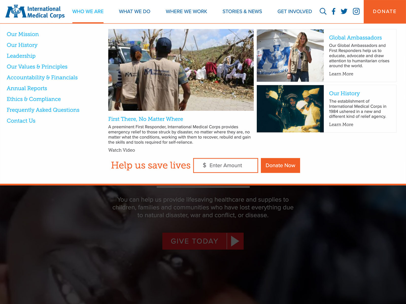
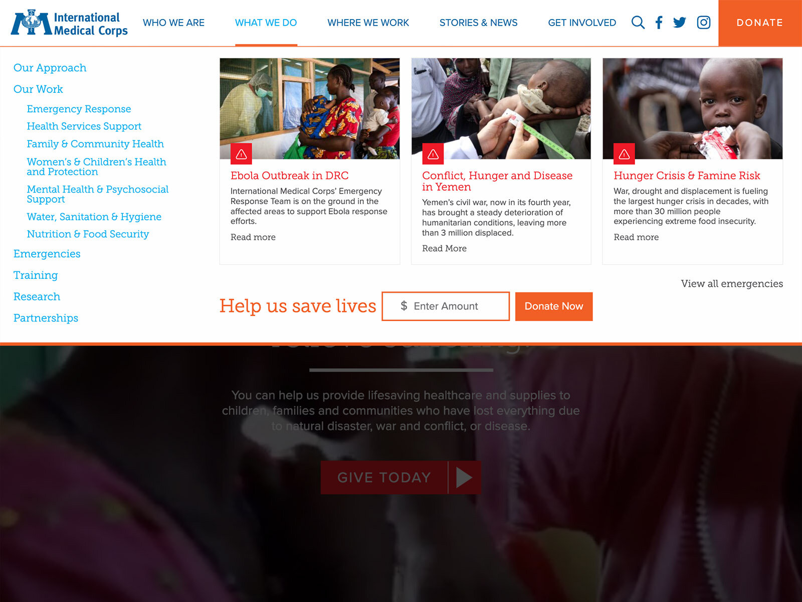
To ease the user into the website, an overview page was required for each top-level category represented in the main navigation. Each page highlights information relevant to the respective category.
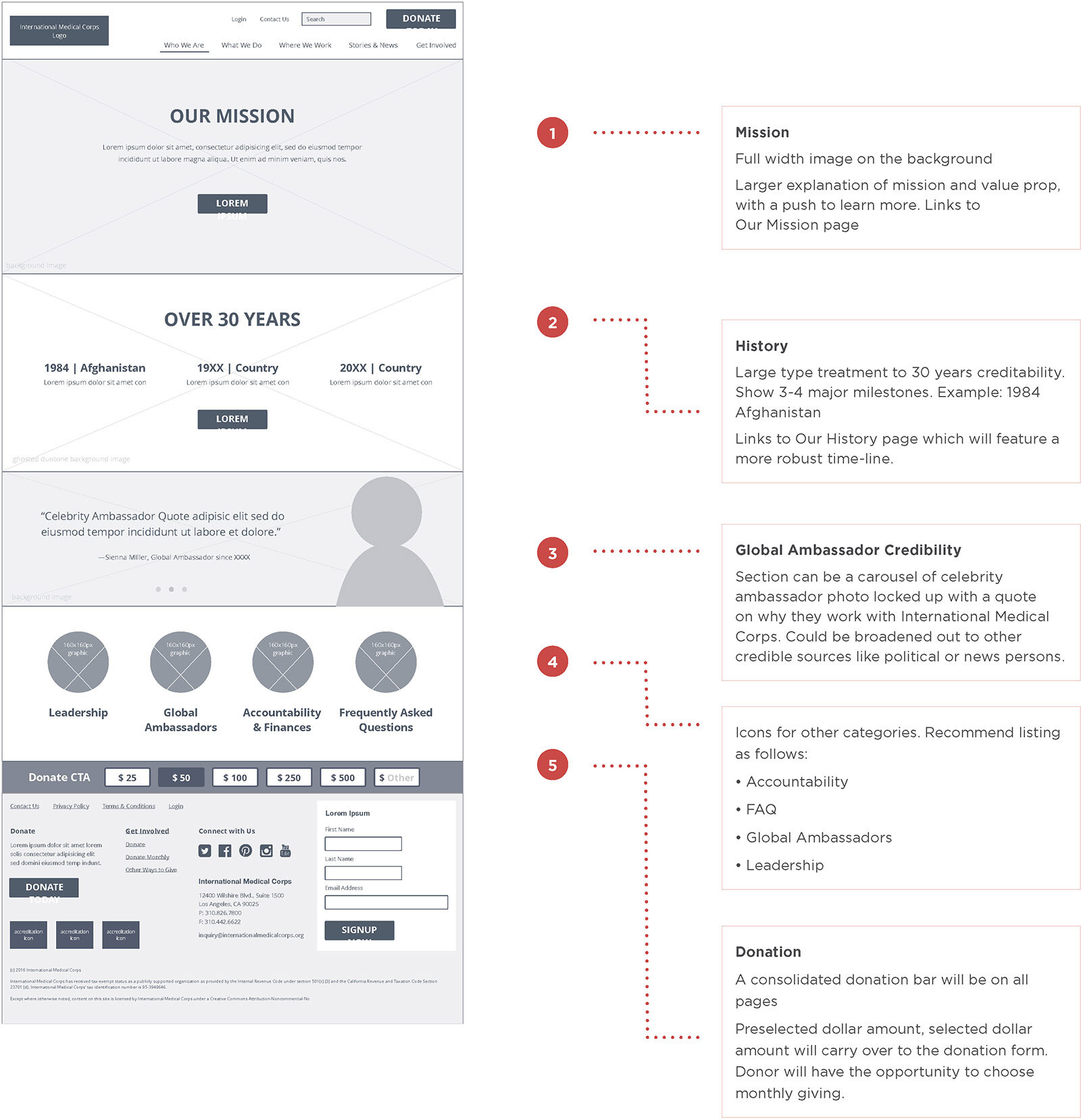
Who We Are
As seen on the right, the organization’s mission is presented as the primary message to the user.
Directly below the mission is the organization’s impact presented as typographical infographics to be easily digested by the user.
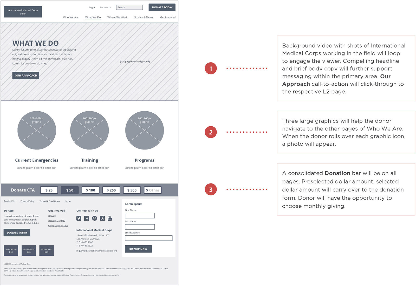
What We Do
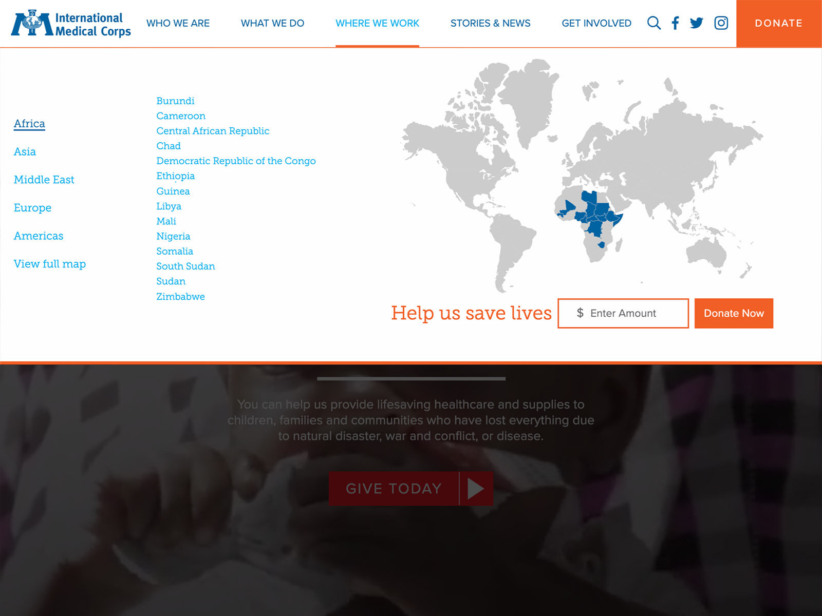
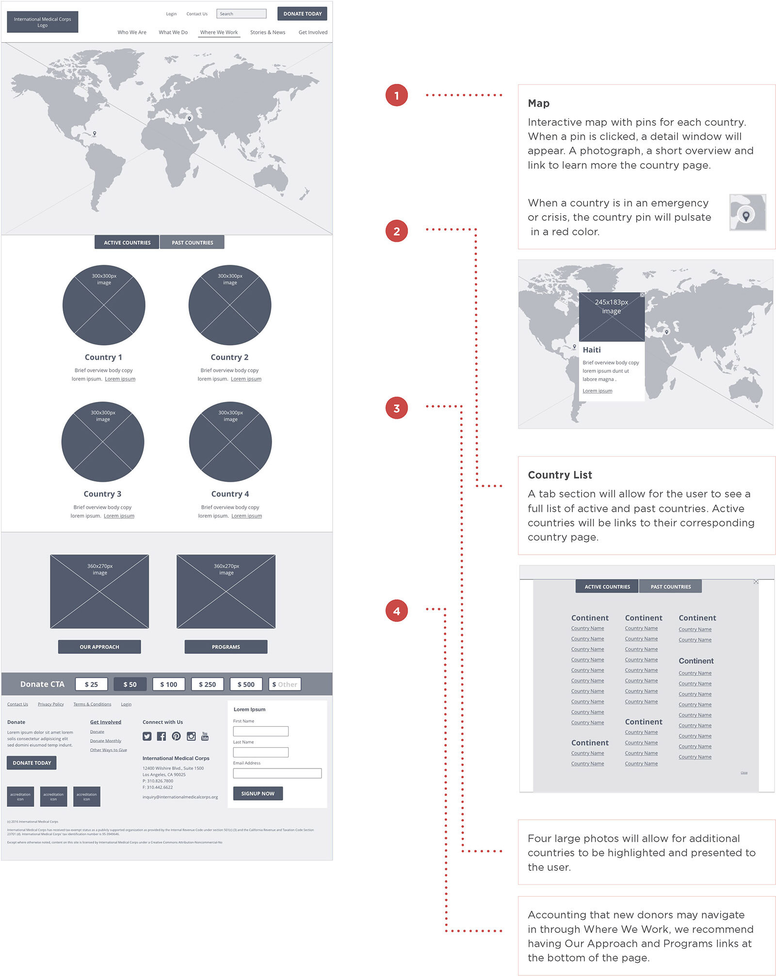
Where We Work
Stories & News
Get Involved
© 2016 International Medical Corps / Russ Reid